New Box Designs!

I am soo soo so (my daughter loves saying this, too) excited about the V-Cut Kraft Noir™ Packaging.

Side-by-side comparison of open and closed V-cut kraft incense box packaging concepts.

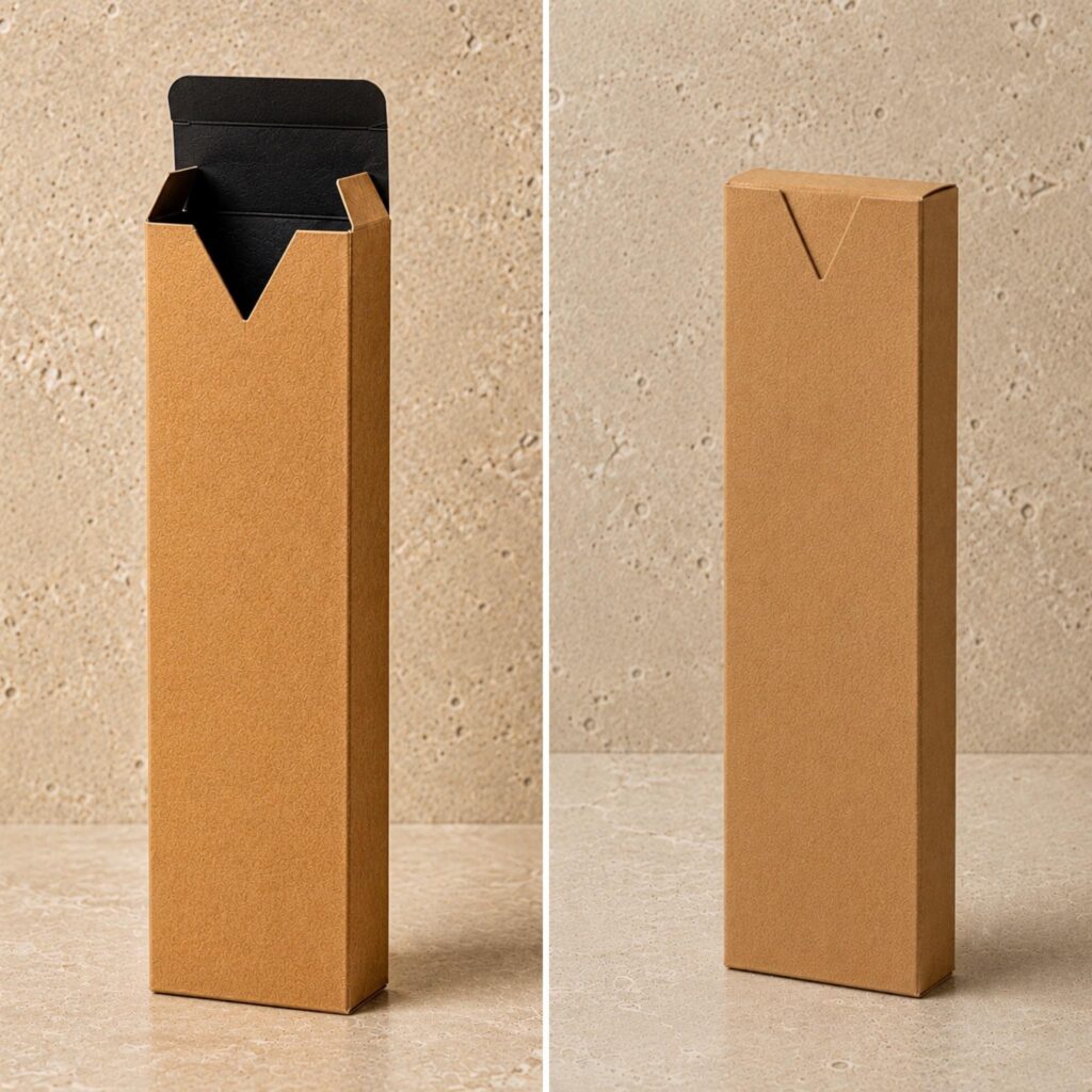
A simple, sleek cut for an unconventional opening.

Luxury kraft incense packaging box with black interior and V-cut tuck flap closure, standing upright on a neutral stone background. Custom incense stick packaging designed by UX BOXES®.

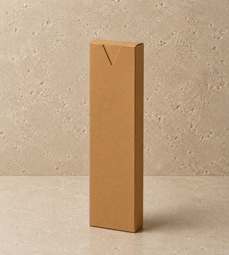
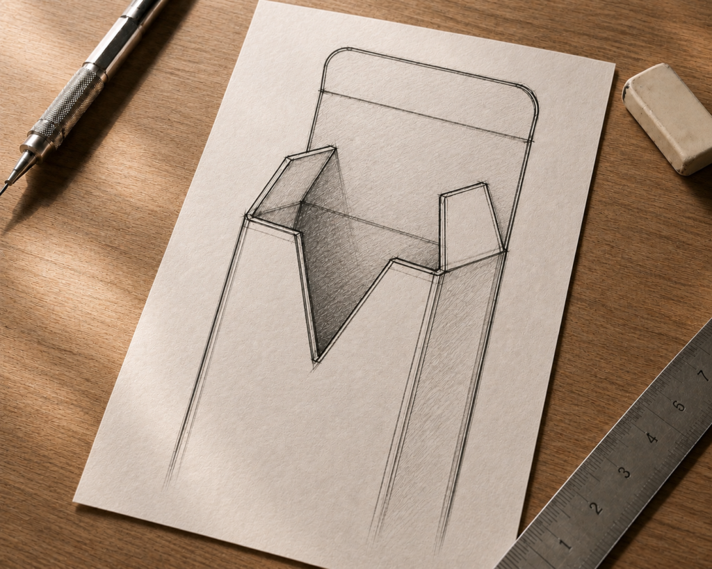
Not your ordinary tuck box . . .

Luxury body oil bottle paired with matching cream textured cosmetic packaging box for retail and small business branding.

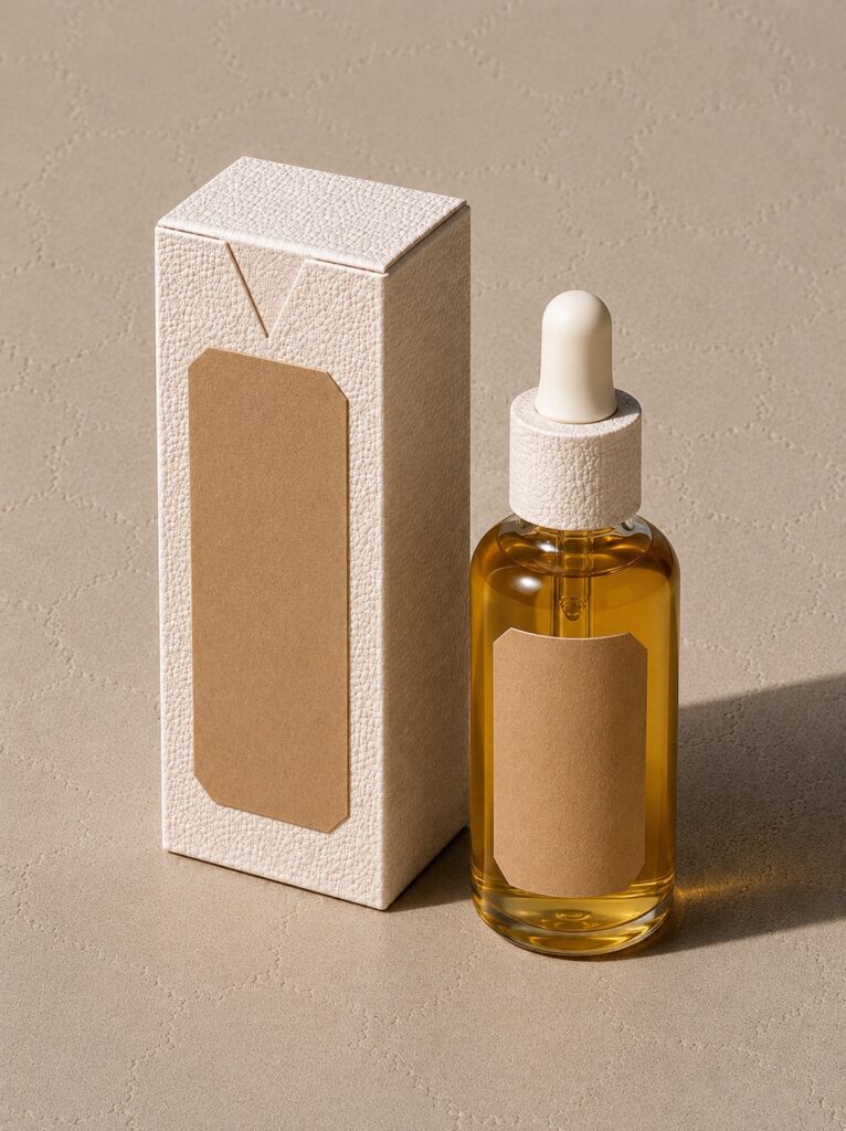
I absolutely love the sharp, angularity detail of the v-cut opening that I felt a label pairing with similar qualities would accentuate further that detail.

Packaging concept sketch displayed on a reMarkable tablet, illustrating a tall rectangular incense box with a distinctive V-shaped front cutout and contrasting interior panel. The hand-drawn structural packaging design is shown in development phase on a wooden desk beside a stylus pen.

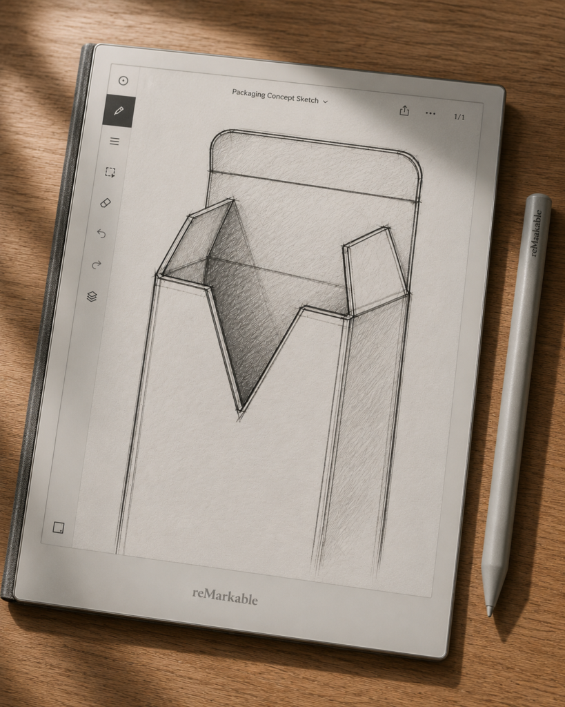
My favorite part to giving a regular tuck box an upgraded look is that the v-cut is more pronounced than the current half-moon cut. An obvious “open here” signifier.

A closeup tall kraft incense packaging box with a signature V-cut front opening and elegant black interior. Luxury incense stick packaging mockup displayed upright against a neutral stone backdrop

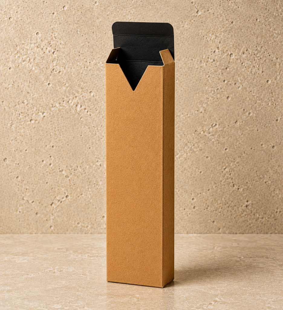
Plus a more refined + upgraded user-friendly tuck box.

Leave a comment

Your email address will not be published. Required fields are marked *